Friday, 4 December 2009
Initial Ideas, Research and Experiments
Friday, 20 November 2009
Wednesday, 18 November 2009
Wednesday, 21 October 2009
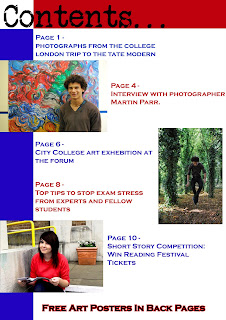
Construction of college magazine cover and contents page
+copy.jpg)
.jpg)
Friday, 25 September 2009
Inspiration for college magazine
The reason I think this style will appeal to college students (and the reason it appeals to me), is because it's simple and to the point, the picture has had time taken over it and it looks professional.

I want to have a cover for my magazine that doesn't patronize students by using bright colours and images of laughing teenagers. As a student, I would want a cover that gave me a few main points of what I would find inside the magazine, and a well taken image which shows that the college is a suitable and enjoyable learning environment.
For my cover I will use one image of a student reading a book, or doing some work, somewhere calm and attractive looking around campus (not the library because that is too cliche). I will have a large header saying 'Norwich City College', and a few main points of what can be found inside the magazine.
The contents page will have more images of students around the campus, doing a range of different things such a sitting outside, being in the art rooms, reading in the library, eating in the canteen etc.
Research for college magazine
 3. This cover is very simple, it is formal like the second cover, as the colours are toned down and it is again of just one student with education objects around her (the books), but unlike the first two covers, this one has a lot less information on it. Just the title: 'My College, Class of 2009', and 3 bullet points of what can be found inside. This cover is simple and to the point.
 2. This cover seems a lot more formal that the first cover, the colours are much more toned down, however the student on the cover is still smiling, showing that she is enjoying college, there are educational things around her such as a globe. There is also another picture at the bottom left on the cover showing a college student working with wildlife in Alaska.
There is a lot of information on this cover, small paragraphs and images giving hints about the topics inside, and yellow font that tells you there is an insert inside of the 2009 viewbook which students would want.
 1. This cover is very colourful and bright. There are what I assume to be students on the front cover, they are happy and smiling, this would suggest to readers that they are having a fun time at college, there is a large header, but a small amount of information written down the side. Just the main topics in the college, such as there visit to auschwitz, sport, and the topic in the largest font set apart from the rest is 'Nick Love, Film Director'. This is the most noticable thing because it would be the most appealing to students.
Friday, 18 September 2009
Construction of CD cover
 Added barcode to corner of image
 Yellow and green hues brightened
 Original image for back cover (cropped)
 Added text along the side of image
 Yellow hues brightened
 Original image for front cover (cropped)
Tuesday, 15 September 2009
Sunday, 13 September 2009
Analysing CD covers
1. Kate Bush - Never For Ever
2. Yeah Yeah Yeahs - Fever to Tell
3. He Is Legend - It Hates You
4. Prince - Purple Rain
5. Michael Jackson - Bad
6. Spinal Tap - Smell The Glove
7. David Bowie - Labyrinth Soundtrack
8. Franz Ferdinand - You Could Have It So Much Better
9. Muse - Origin of Symmetry


